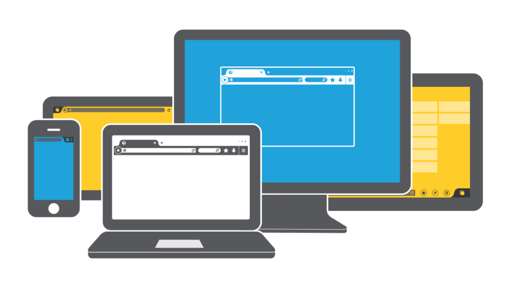
One of the biggest mistakes one can make when working on their website is thinking about user interface as about the bunch of pixels and buttons. The user interface (or UI) is more of a set of steps and deeds your users would take to interact with your website. Depending on the type and content of your website, think about tasks users can perform and prepare all the tools for him to succeed.

Clear Navigation is the Key
No user that comes to your site in search for something should get lost on the very first page. The confused user is the lost user as he leaves your website soon. Did you prepare lots of cool and creative things for your users? But people will never appreciate this fancy stuff if they lose the idea where they are and how they should look up for the information. Thus, there are two rules you should never break when working on the site navigation:
- Navigation system is consistent. Don’t move the menu bar around the page unless it is really necessary. Most websites have their menu at the top of the page – make sure it remains there. Don’t create unnecessary obstacles on your user’s way just because you want to impress them with your original ideas. Most of the time people would stick to something more common and familiar.
- Orientation is essential. At any moment while on the website, your users should understand where they are located. Highlighted menu items, breadcrumbs or headers – choose the method to your liking but be sure you include this in your UI.
Be Wise about Input Controls
Input controls are the essential part of the overall user interface for your website. Without the interaction, your interface will do little for the users, so pay attention to providing users with more options. Yet, be wise here – each new control adds complexity to the user interface. As a result, you will get cluttered interface full of elements and options that would confuse users and make them leave the website. That’s why you should better aim for the minimal design.
So how do you solve the problem? Consider implementing controls on demand that are hidden until needed. Put all the additional options somewhere for hovering of a mouse to reveal them. This way you can save much screen space without cutting on the functions.
Use Animation to make User Interface Lively
The use of animation is underrated; yet, you need it for quality web user interface. Not only the good animation brings together the whole interface – it would make the user experience on your website more coherent.
Make our human nature work for the success of your website. It is proven that our eyes are attracted to movement – thus your animated icons would be well seen and reacted to.
You will be surprised by how users are generally open to suggestions. For sure, the key to success is in the balance – you should never be too invasive with the suggestions. But several steps your users would love to take but rarely think about would do just fine. Using several useful hints shown to your users on certain pages of the site can provide more engagement. It can even help you to gather reviews for improving your website later.
Now you already know that User Interface is more than just a cool design. Built the right way, good UI will provide a lot more fun to your website while helping users accomplish the tasks and goals they have. Excellent site navigation will ease down users’ way to the destination. And your guided actions help you learn more about your users without being too invasive. All these smaller things will keep visitors coming back to you.